


 |
| John Lennon with the circus poster, 1971. Inserted: The new reproduction. |
The "Mister Kite" circus poster is reproduced for inclusion in the DeLuxe Anniversary edition of "Sgt. Pepper's Lonely Hearts Club Band"
 . Here's John with the original, alongside the part of the repro poster that is visible in the pack shot of the anniversary release.
This poster has been reproduced several times, most famously by Peter Dean in 2012 but also by "The Propsmith" after he was unhappy with Dean's effort. So how about this new one? Do you think Yoko has allowed them to photograph the original to ensure the reproduction is as close to the real one as possible?
 |
| A version I bought in Hamburg in 2006 - printed with red ink. |
Since the Lennon photo is black and white, how can we know that his poster was printed with black ink? A reader sent in this colour photo from 1967 of "The Fool" (Simon Posthuma and Marijke Koger) painting John's piano. In the upper right corner, the "Mister Kite" poster is just visible. It looks to me like it's printed using red ink, but it's difficult to be certain.
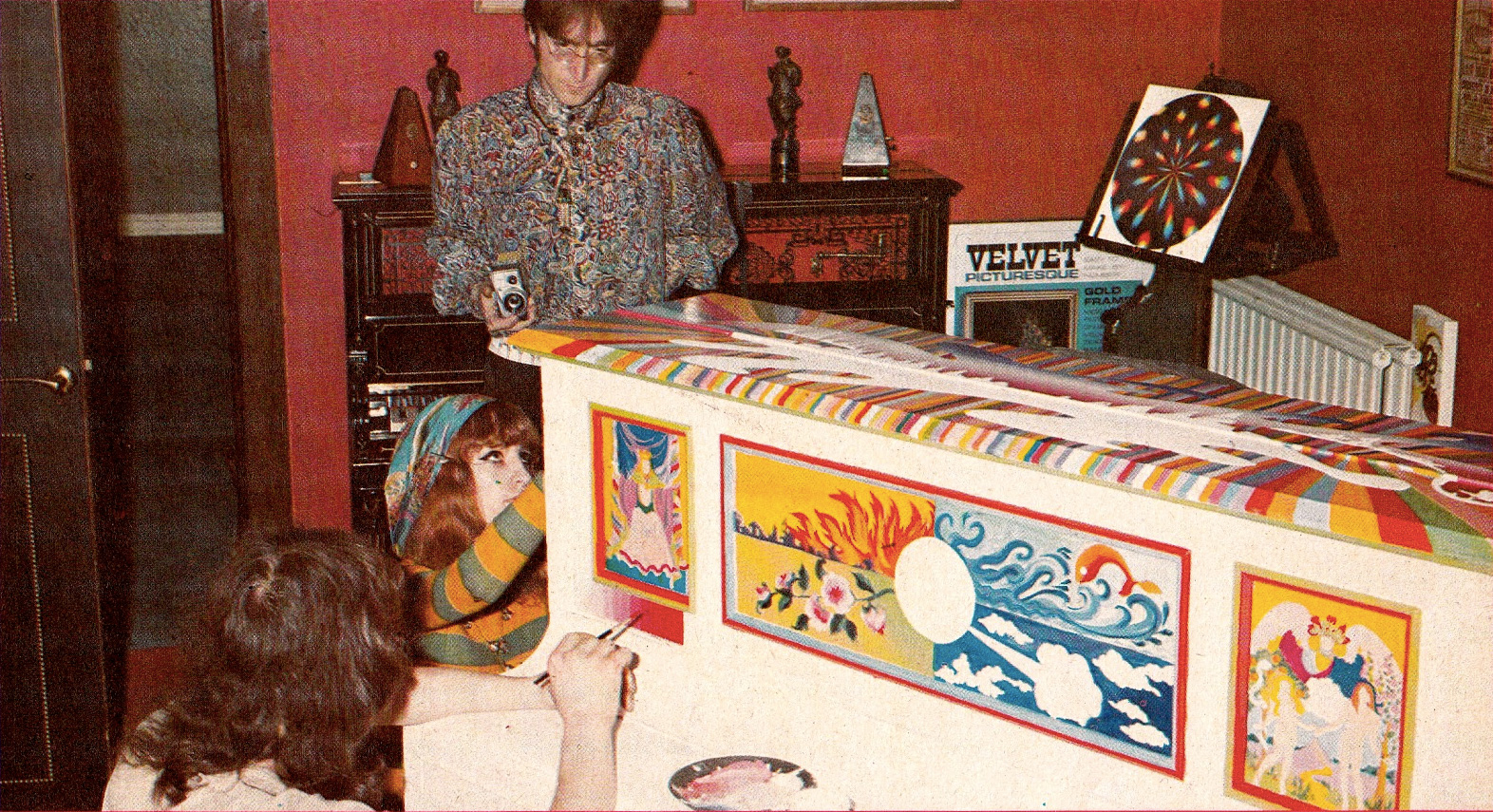 |
| The poster is barely visible in the upper right corner of this 1967 colour photo. |
4 comments:
https://4.bp.blogspot.com/--aX4w4qij9U/UJ5hTlyrh7I/AAAAAAAACRA/t1OlqKHAbG0/s1600/SWEET+JANE+BLOG-JOHN+LENNON+(C).jpg
The Apple repro looks pretty good, at least on a par with the Propsmith’s; however, the left gap to the border looks a little too thin at the bottom and a little too thick at the top.
Gary Aurit: Looks a bit on the red side to me! Thanks for the photo.
No problem Rog. There's other copies out there that have less screen (dot pattern), and those look pure black. Check out this one.
https://2.bp.blogspot.com/-_5WzHcBDKCs/UxSy2gFrL_I/AAAAAAABMYk/-0Z4gt-XxoI/s1600/pi1.jpg
Your print is still pretty sweet though, and I don't think the one reproduced for the album is perfect either.
g-force
Post a Comment